
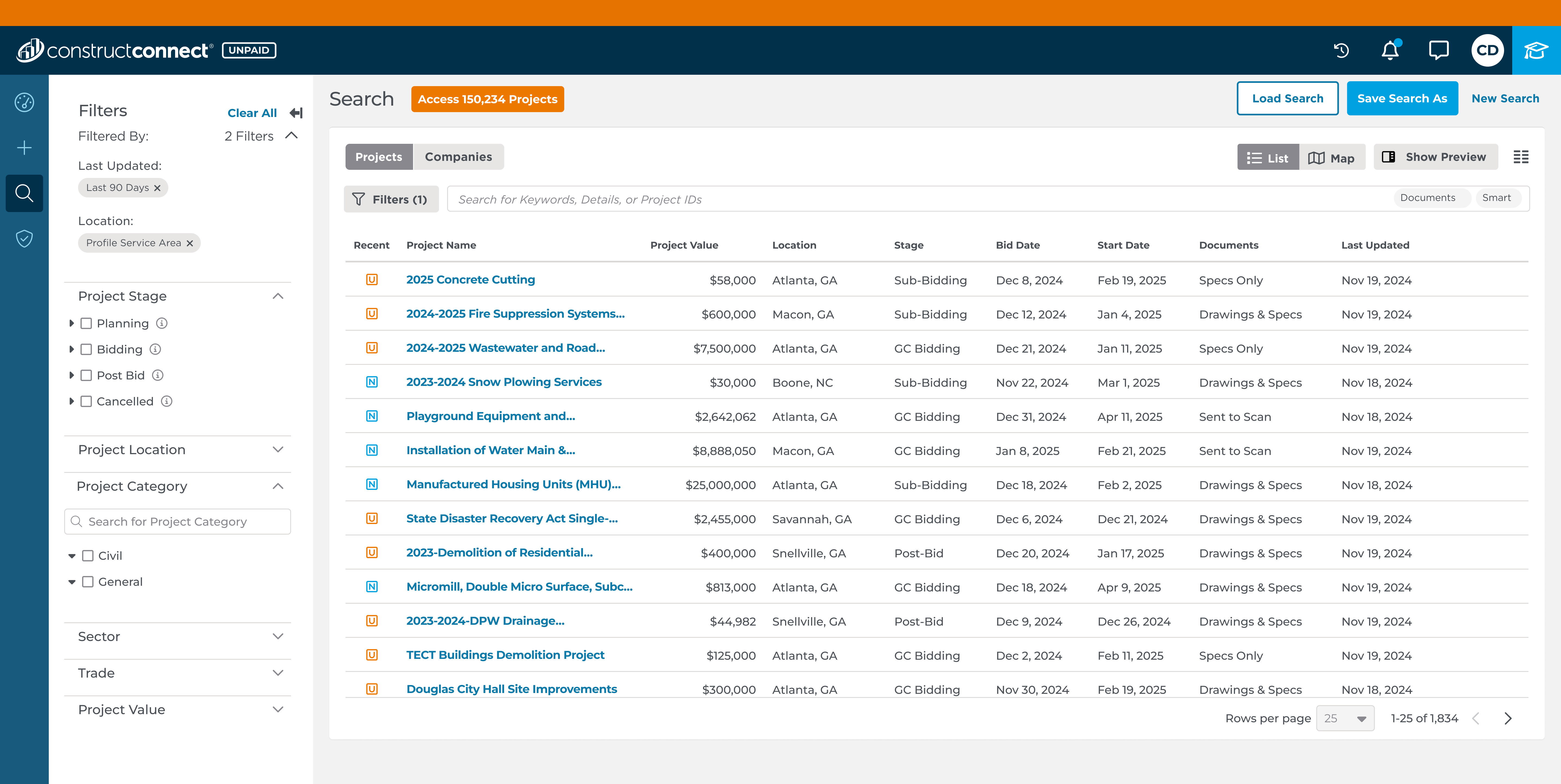
Our platform’s core feature—Search—was paywalled. Prospects couldn’t explore the product without going through sales. That model capped our scalability, raised acquisition costs, and missed a massive product-led growth opportunity.
As the lead designer, I collaborated closely with a product manager, UX and UR designers, an engineering lead, and a team of five engineers, meeting daily to ensure seamless integration. I also worked in tandem with our product marketing management team, UX Content team and with the quality engineering staff.
Timeline 7 Months

Our construction project management SaaS platform had never offered any unpaid access to users. Search functionality - our biggest revenue driver and core product - was exclusively available to paying customers. We relied heavily on a traditional sales-led model where potential customers could only experience our platform after going through sales representatives.
How do we expose high-value functionality to unpaid users without undermining our premium tiers?
General Contractors (Primary Focus)
- Need overall project assessment and risk evaluation
- Coordinate multiple trades and subcontractors
- Make go/no-go bidding decisions quickly
- Focus on trade-specific requirements
- Need to extract relevant information from large document sets
- Work under tight deadlines with limited research time
- Require precise quantities and specifications
- Need detailed cost-impacting information
- Must ensure accuracy to avoid bid errors
Giving users meaningful access to Search meant we:
Enabled self-service product exploration, for the first time in company history
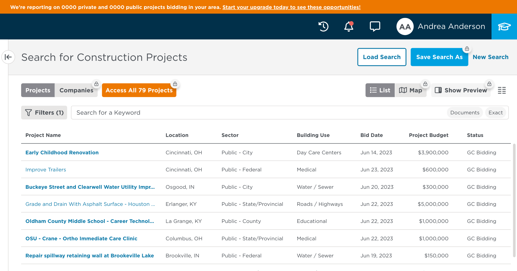
5 free project detail views with strategic blurring (not gating)
Full search functionality with limited filters (7 of 28)
Clear upgrade prompts triggered by behavior, advocating less banners
Enabled prospects to experience the genuine product value before making purchase decisions.
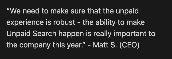
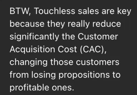
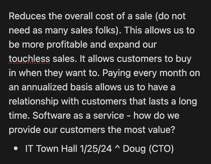
The goal was to build trust through transparency—not bait-and-switch tactics—directly supporting the company’s #1 initiative of enabling touchless sales.
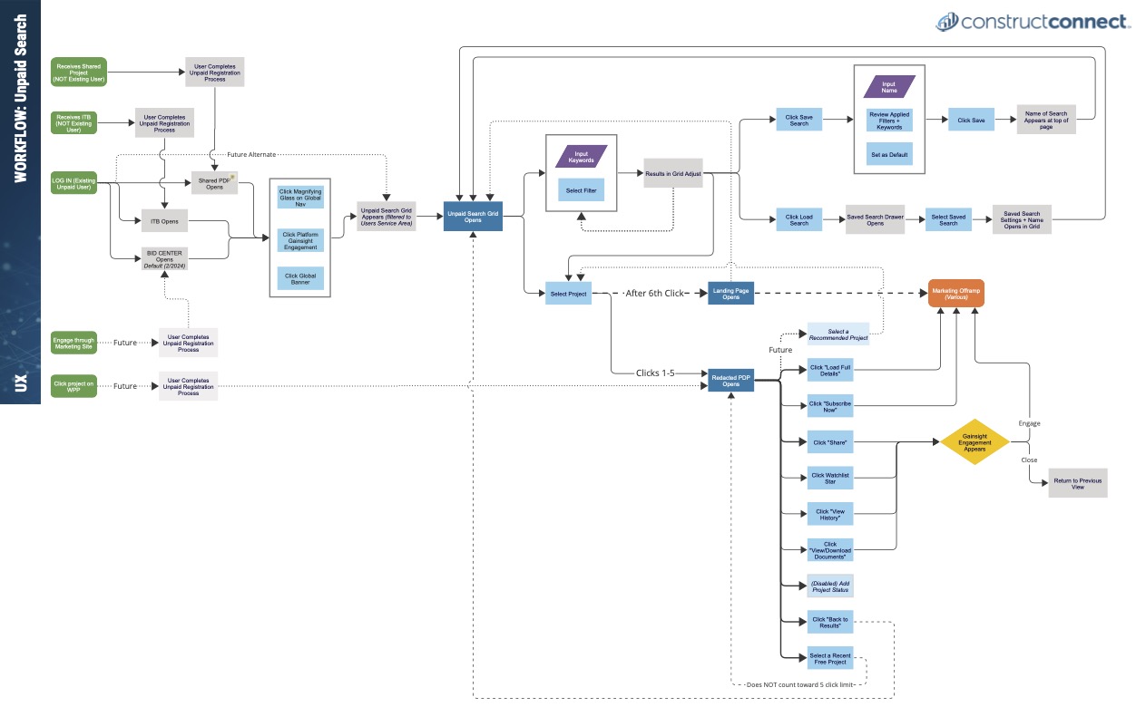
Creating a cohesive experience across various entry points, provided a structured and effective approach that we might have missed otherwise. This workflow served as the roadmap for our team to design, test, and refine Unpaid Search, ensuring we met user needs and achieved business objectives.
I worked closely with a UX partner to develop our workflow, which informed the entire design process.
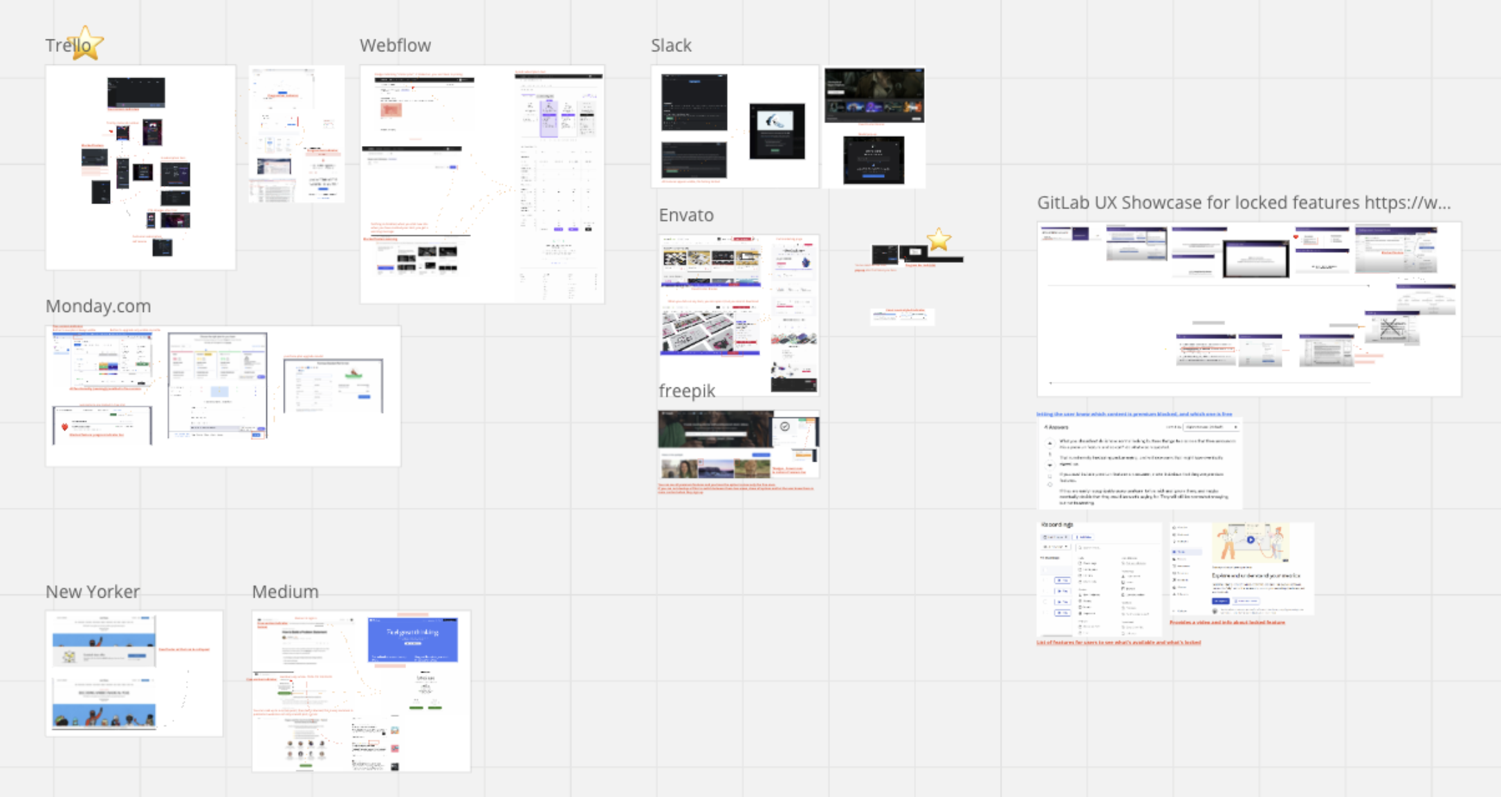
Research Miro board from other Unpaid experiences
Determining what functionality unpaid users should access within our existing paid system without undermining subscriptions was a big challenge.
New Free Tier: Full search functionality with top 7 most-used filters (instead of all 28), trade code browsing, 5 free project detail page (PDP) views with blurred content
Existing Paid Tiers: Maintained current premium features like customize columns, advanced analytics, full filter access, complete data visibility, access to proprietary document viewer tool
Our goal was to create an experience that builds trust and encourages upgrades without distracting from our product or misleading users. We decided to visually indicate features as enabled but non-functional, prompting a marketing message when clicked. If a feature isn't part of an upsell path, it can be disabled with a tooltip explaining its unavailability for unpaid users.

Users were confused by this aggressive error modal during checkout. Our solution was to get rid of it and add a clear call-to-action button that tells users where the error was and where to go next.

Originally this progress bar was designed in Adobe XD. However, we had to modify it using Bootstrap components when coding because the development became too complex and time consuming.


After several iterations, we decided to show input errors this way. We first showed a red outline around the input box, then we decided to add an "X" and checkmarks for users who have colorblindness.
A PM suggested adding locks to premium features, but it was deemed too cluttered for our platform.
Using boxes to obscure content was another early idea. However, it was concluded that this approach would be too distracting and potentially frustrating for users.
After multiple revisions, we opted to embrace the concept of blurring proprietary content.
I examined UX strategies in other apps, noting how they communicated limitations. Some used visual cues for blocked features, others had paywalls highlighting upgrade benefits, and some offered metered trials with limited feature access before prompting subscriptions. Here's what we did!
We aimed to clearly inform users about the number of PDP views available to them.
Upon reaching their 5 PDP view limit, users are redirected to a marketing page but can still revisit previously viewed projects.
We successfully launched the company’s first-ever freemium experience, opening our most valuable Search feature to non-paying users while maintaining revenue protection.
What was the business impact?
- Delivered foundation for $4M revenue target through product-led growth
- Established company’s first freemium offering around core revenue driver
- Created scalable customer acquisition channel independent of sales team
- Enabled prospects to experience genuine product value before purchase decisions
Understanding what is technologically feasible is vital to the success of all digital products and should inform design decisions. I wrote an article about having empathy for developers - please check it out!